
Value Studies in Watercolor: Andy's Method for Better Paintings
from Andy Evansen
What Is a Value Study and Why Does Andy Rely on Them?
A value study is a quick black-and-white version of a planned painting that maps out light, middle, and dark shapes before any color is used. According to Andy, the purpose is not to create a miniature finished painting — it is a vast oversimplification that identifies the biggest, most descriptive shapes in a scene.
Andy emphasizes that a value study serves several purposes at once:
It reveals whether a scene will actually work as a painting before hours are invested in color.
It works out compositional problems found in reference photographs.
It provides brushwork practice for the exact passages that will appear in the final piece.
It builds confidence going into the painting.
As he puts it, spending five or ten minutes on a value study beats wasting four or five hours on a color painting only to discover the scene wasn't strong enough. If a scene isn't working in black and white, Andy considers that a red flag — a signal to reevaluate whether it's worth painting at all.
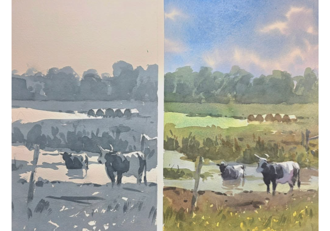
Why Reference Photos Almost Never Work As-Is
Andy stresses that it's rare for a photograph to be "all squared away and ready to make a good painting." Value studies are where he takes liberties he would never risk mid-painting. Common photo problems he corrects at the value-study stage include:
Everything sitting on the same line. In one farm scene, all the interest sat in a single horizontal band — an empty sky above, a cornfield running straight across the bottom. His fixes: darken some of the corn in a corner to break up the foreground, and vary the tree shapes so they aren't all the same height.
Repeated heights. In a scene from England, a tower and a nearby tree were nearly identical in height, with everything else falling along one line. Andy's solution is to play with the heights — make the tower taller, raise the tree on the left, drop another tree down and give it a cast shadow — until the silhouette becomes more interesting.
Visual clutter. A boatyard scene on Catalina Island was full of storage bins and junk behind the main boat. Andy removed nearly all of it, extended a cliff line that had awkwardly disappeared behind the boat, and kept only one storage container as a useful shape. As he notes, no one viewing the painting will ever know the artist wasn't simply standing in a slightly different position.
Directional lines leading the eye out of the picture. In a street scene, the road, the sweeping shadows, and even a small figure all pushed the viewer's eye straight out of the composition. His fixes: flip a power pole to the other side of the street to act as a "stop sign" for the eye, and move the figure so it walks into the scene rather than out of it.
Poorly placed focal points. In a farmyard scene with a horse, Andy moved the horse so its sunlit side sat in front of a dark doorway. That one small repositioning lets him negatively paint around the horse later so it reads clearly — instead of getting lost against a white building.
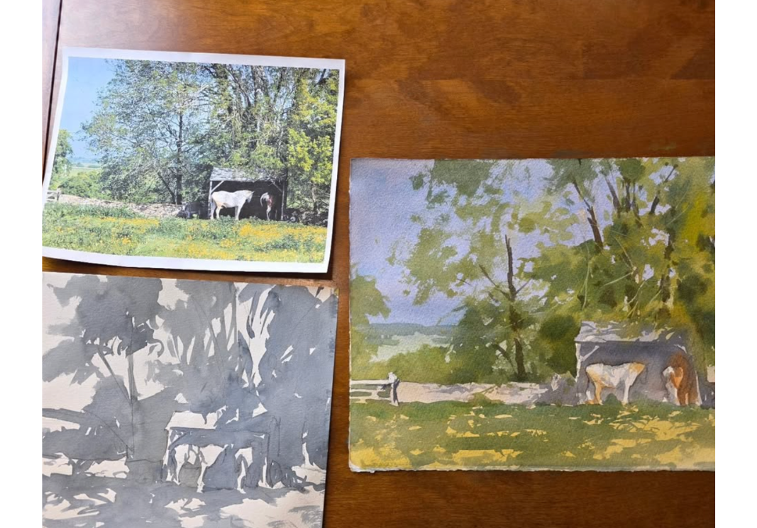
The Big Puddle Technique: How Andy Paints Connected Shapes
One of the most repeated teachings in Andy's approach is his wash technique. When painting the big middle-value shape of a value study, he:
Mixes one nice big puddle of paint.
Starts at the edge of the paper — left side, top, wherever the shapes begin.
Paints a little, reloads the brush, comes back and touches the wet edge exactly where he left off.
Repeats — paint, reload, touch the wet bead — all the way across the shape.
The goal is a smooth, continuous wash where one value represents many objects, with soft "lost" edges where shapes meet. Andy points out that this is deliberate rehearsal for the color stage: in the final painting he'll change colors on the brush — green trees to gray shadow, to brown, to blue-gray, back to green — while touching that same wet bead. Practicing the mechanics in monochrome makes it far easier later, because as he warns, everything gets "ten times more difficult" once multiple color shifts and values are in play.
His mantra during these washes: connect, connect, connect. Nothing in a good value study sits on its own — every shape touches something else. When a shape does float in isolation (a distant "island" of buildings in a snowy field, for example), he looks for a way to link it, such as dragging a dry-brushed plowed field outward until it connects.
Values Are Not Just Sun and Shadow
A key insight from Andy: values are not simply "what's in sun and what's in shadow."
In the horse scene, the grass was clearly in full sunlight — yet when he compared it to the light side of the horse and the white buildings, the sunlit grass was actually about the same value as the trees. That means the grass functions as a middle-value negative shape that defines the true lights.
The same principle appeared in his sheep painting: the grass was sunlit, but it needed to be dark enough to define the sheep and negatively paint around their legs — legs that weren't even visible until the dark grass shapes carved them out. And in a scene with a rusty roof, surfaces in full sun were still darker in value than other sunlit shapes nearby.
Andy's tool for seeing this correctly is simple: squint. He squints constantly, in classes and demonstrations, and paints what he sees when he squints — not all the small details . The big shapes are what viewers notice from across the room, and if they're accurate and descriptive, the viewer already understands the scene before a single detail goes in.
Simplify: Paint What's Important, Leave Out What's Not
Photographs contain enormous amounts of unnecessary information — white sheds, trailers, bins, power lines, roadside noise. Andy's process is to find the important shapes and eliminate the rest. Guidelines from his teaching:
Don't attempt a black-and-white version of the entire painting. The value study should be a radical simplification into the biggest descriptive shapes.
Make the big shapes descriptive. Because so much detail is being removed, the large shapes must be well drawn and clearly readable — vague shapes fail the viewer.
Stick to the map. When moving to color, resist the urge to make the painting more complicated or more "accurate" than the study. The study is the plan.
Get values right the first time. The sooner the correct value and color go down in the wash, the cleaner and fresher the painting looks — repeated corrections muddy watercolor.
He also uses value studies to test optional details: power lines, fence bars, a lone pole with wires. If a practiced detail doesn't work in the study, it simply doesn't go in the painting.
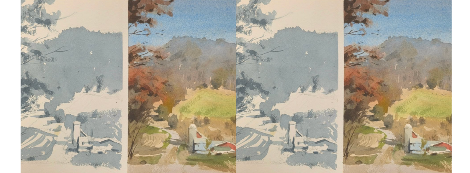
Creating a Hierarchy of Darks
When the middle-value wash is complete and the study "looks like something," Andy adds darks — and here he teaches a deliberate hierarchy:
The darkest darks and strongest contrast belong at the focal point — the horse against the doorway, the big boat, the sheep.
Distant darks stay lighter. A darker tree in the background may be needed to pop a farmhouse, but it should never rival the foreground darks.
Darks are painted as smaller, more deliberate shapes, unlike the one-puddle middle value, allowing practice in varying their strength.
This hierarchy keeps the viewer's eye where the artist wants it and preserves depth.
When Is a Value Study Unnecessary?
Andy acknowledges that some subjects — fog, moody atmospheres, soft-edged skies with big simple shapes — don't demand a value study. But for complicated scenes with structures and definite light and shadow, working through the shapes in black and white first is essential. And he cautions against the common excuse "I can already see the values": a value study isn't only about seeing values — it's about making adjustments, because it's rare that everything in front of you is ready to go. The goal is always a better painting, not a copy of the photograph.
Frequently Asked Questions
How long should a value study take? About 10-15 minutes, according to Andy. It's a quick planning sketch, not a finished artwork.
How many values should a value study have? Andy stresses that it’s not a tonal ‘painting’ and works primarily with a simplified scheme: the white of the paper for lights, one big connected middle value, and a limited hierarchy of darks placed last.
Can you change a reference photo in a value study? Yes — that's a primary purpose. Andy routinely moves horses, poles, figures, and trees, removes clutter, changes building colors, and varies heights. The value study is the safe place to take liberties.
What does "negative painting" mean in this context? Painting a darker value around a lighter subject so the light shape emerges — such as dark grass carving out sheep legs, or a dark doorway defining the sunlit back of a horse.
Why not just start painting in color? Because color adds complexity on top of value decisions. If the composition and values haven't been solved first, the artist ends up making risky changes mid-painting — or discovers hours in that the scene never worked.
Key Takeaways from Andy's Value Study Method
Spend 10-15 minutes in black and white before hours in color.
Use one big puddle; paint, reload, and touch the wet edge for smooth connected washes.
Squint — paint the big shapes you see when you squint, not the details.
Values aren't just sun vs. shadow; sunlit areas can still be middle values that define your lights and even rainy days have value structures.
Nothing floats alone — connect every shape to another.
Fix the photo's problems in the study: vary heights, remove clutter, redirect the eye, reposition focal points.
Save the darkest darks for the star of the show; keep distant darks softer.
Keep it simple, and stick to the map when you go to color.