
Choosing Between Light and Shadow
From Matt Smith
One of the most important — and often overlooked — decisions an artist makes in a painting is where the viewer’s attention should go. Is it the light? The shadow? The color? The values?
As Matt often emphasizes, a painting can’t be about everything at once. When too many elements compete for attention, the message becomes unclear.
Matt revisits a core principle of strong design:
rendering highlights while simplifying shadows — or rendering shadows while simplifying highlights — as a deliberate creative choice.
Every Painting Needs a Clear Leader
Matt frequently compares this idea to the relationship between value and color:
If a painting is about value, color should be simplified.
If a painting is about color, value should be simplified.
The same principle applies to light and shadow. One must lead, and the other must support.
In this particular painting, the focal point was a dramatic clipped silhouette against the sky. Because of that, Matt chose to place the emphasis on the highlights. Everything else — especially the shadow areas — was intentionally narrowed and simplified.
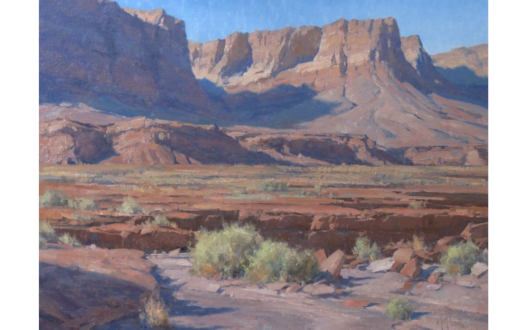
By keeping the shadows passive, the highlighted areas become more active and resolved. This contrast creates clarity and focus within the composition.
Design Decisions Must Be Intentional
From a design standpoint, Matt stresses that these decisions need to happen early in the process. They must be conscious choices, not afterthoughts.
Before committing to detail, he encourages artists to ask:
What is the core idea?
What supports that idea?
What needs to remain quiet so something else can stand out?
What needs to be edited out?
If the focus were instead on what was happening in the shadows, that’s where the rendering would occur — while the highlights would be simplified into more graphic shapes. In this painting, the shadow shapes were carried consistently throughout the composition, remaining unified and restrained rather than broken into excessive detail.
Let Highlights Guide the Viewer
When highlights are in charge, they naturally lead the viewer’s eye through the painting.
In this work, Matt designed the light to move:
From the dry wash
Into the highlighted bush
Across the composition
And back down again
This visual flow is the result of intention, not chance. Matt makes clear decisions about what leads, what supports, and why, and he encourages other artists to do the same.
Definition vs. Relief
One issue Matt frequently sees in student work is that everything is rendered equally. When light and shadow receive the same level of attention, hierarchy is lost.
Instead, he advises thinking in terms of:
Areas of definition, where information is rendered
Areas of relief, where information is simplified
This approach applies not only to light and shadow, but also to:
Color
Value
Texture
When an area is heavily rendered in the foreground, Matt gradually reduces detail as it moves into the distance. This creates depth and reinforces the illusion of three-dimensional space.

Strength Through Simplicity
Even simple shapes can feel dimensional when handled with intention.
Matt often demonstrates how a simple form with:
A highlight
A shadow
A midtone
— along with subtle textural variation — can move dimensionally in space without distracting from the focal point. Silhouettes, when locked against darker values, become strong entry points that help guide the viewer through the painting.
Creative Rearrangement Is Essential
For Matt, painting is about more than copying what’s in front of you.
When working from photographs, artists are naturally limited by the original scene. But Matt encourages painters to ask:
How do these elements relate to one another?
What happens if an element is repositioned?
What can be simplified to strengthen the idea?
Once artists begin thinking in terms of design rather than documentation, creative possibilities expand.
A Valuable Exercise to Revisit
Matt often refers back to a challenge he gave students in the past: paint the same subject twice —
Once by rendering the highlights and simplifying the shadows
Once by rendering the shadows and simplifying the highlights
This exercise helps clarify intention and strengthens an artist’s ability to control visual hierarchy.
When squinting at strong paintings, large areas often resolve into one simple shape, even when subtle temperature changes exist within the same value. Rather than painting every crack or striation, Matt favors warm-and-cool shifts within a unified value to maintain cohesion.

Final Thoughts
Clarity begins with intention.
Matt encourages artists to decide what will rule the painting — light, shadow, color, value, or texture — and allow everything else to support that decision. When that clarity is present, the work becomes stronger, more purposeful, and far more compelling.
Clear vision leads to confident paintings.
Learn more from Matt Smith below: