
Color Harmony in Painting: Choosing Colors That Work Together
from Kenn Backhaus
Color harmony is the practice of choosing colors that work together to create unity, mood, and balance in a painting. Rather than just picking colors you like, color harmony means observing and understanding how colors interact in nature — and translating that relationship onto the canvas.
What Is Color Harmony?
If you've ever looked at a painting and felt that all the colors just seem to work perfectly together, that's color harmony at play.
Think of it like picking out an outfit where everything matches and makes you feel confident. In painting, color harmony means using colors that work together to create a specific mood or feeling:
For a lively, energetic mood: Use colors opposite each other on the color wheel (complementary colors), like blue and orange. These colors naturally stand out against each other, creating a dynamic effect.
For a peaceful, calm mood: Use colors next to each other on the color wheel (analogous colors), like green and yellow. These colors blend smoothly together.
How to Find Color Harmony When Painting From Life or Photos
When painting from life or using a photo as a reference, start by identifying the main colors in the scene.
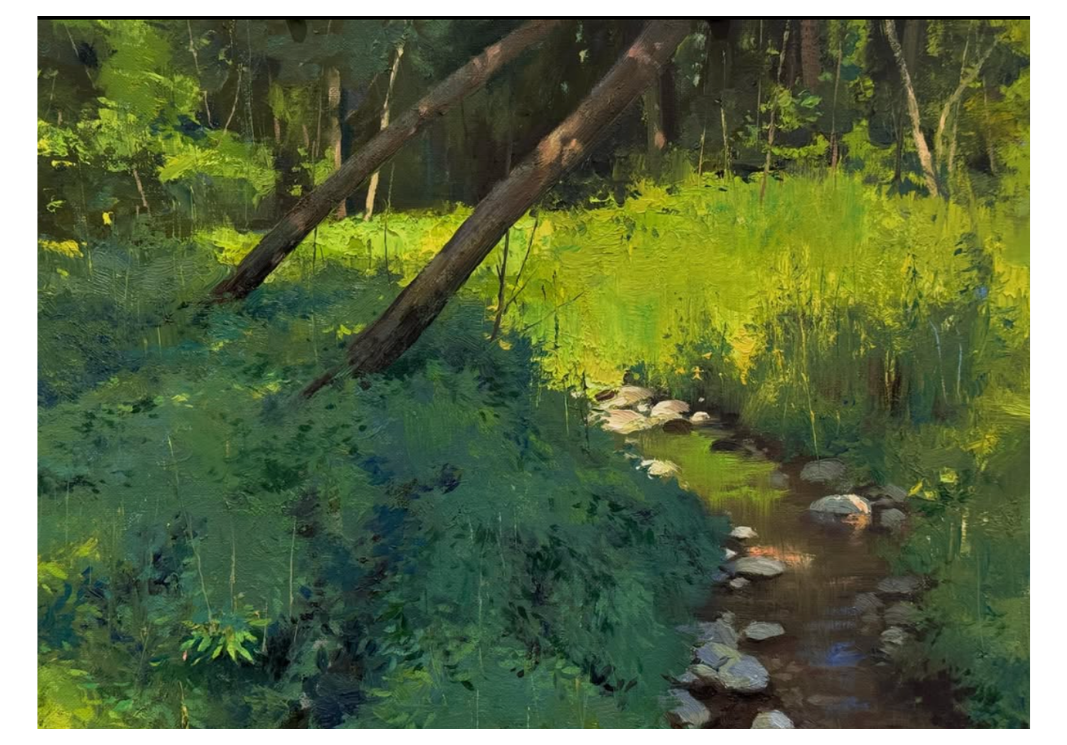
Nature is full of subtle, greyed variations in color. In a landscape, for example, the greens of trees and plants aren't just one shade — they shift depending on where light hits them:
Green in direct sunlight often looks warm and bright, sometimes with a yellowish tint.
Green in shade often looks cooler and darker, sometimes shifting toward blue-green.
These variations are what make a painting look realistic and harmonious.
Why Light Matters for Color
Light plays a huge role in how we perceive color. A tree looks different in bright sun compared to shade:
In sunlight: leaves may take on a yellowish tint.
In shade: leaves may take on a blue-green hue.
Understanding how light affects color helps you paint scenes that feel true to life.
Learning From Master Artists
Studying master artists is one of the best ways to understand color harmony in practice.
Edgar Payne and Walter Launt Palmer were both experts at using color to build depth and mood. Payne, for instance, often chose subjects made up of just a few colors to create balance — but varied the color temperature across the painting to create a sense of perspective. Foreground elements in warm sunlight or cool shadow contrast with background elements that appear lighter and softer. This shift is what creates aerial perspective — the illusion of depth through color and value changes with distance.
Referenced work: South Fork (of) Canyon De Chelly by Edgar Payne

South Fork (of) Canyon De Chelly by Edgar Payne
A Practice Exercise for Learning Color Harmony
One of the most effective exercises: paint a scene exactly as it appears, without changing anything.
This forces you to:
Really observe the colors in nature and how they relate to each other.
Resist the urge to tweak or "improve" the colors before you understand them.
Build skill in mixing and matching colors accurately.
As you repeat this practice, you'll start noticing how colors interact and how light and shadow change their appearance — the foundation of harmonious, believable paintings.
Frequently Asked Questions
What is color harmony in art? Color harmony is the use of color combinations that create visual unity and a specific mood, based on relationships on the color wheel (such as complementary or analogous colors).
What colors create an energetic mood in a painting? Complementary colors — pairs opposite each other on the color wheel, like blue and orange — create energy and contrast.
What colors create a calm mood in a painting? Analogous colors — pairs next to each other on the color wheel, like green and yellow — create a smooth, peaceful effect.
What is aerial perspective? Aerial perspective is the technique of using lighter, softer, cooler colors in the background and stronger, warmer, or more saturated colors in the foreground to create a sense of depth and distance.
How can I practice color harmony as a beginner? Paint a real scene or photo exactly as you see it, without altering the colors. This builds your observational skills and your ability to mix accurate color relationships.
Is it okay to copy another artist's painting to learn from it? Copying a painting for personal study and skill-building is a widely accepted learning practice. It becomes an ethical or legal problem only if you try to pass the copy off as original work or sell it. The goal of studying another artist's work is to understand why it works — composition, color harmony, brushwork — and apply those principles to your own original paintings, not to replicate their work for profit or credit.