
Designing for Simplicity
from Mitch Baird
When it comes to painting, there’s one guiding principle that consistently brings strength and clarity to your work: simplicity. At its core, simplicity is about making a visual impact on the viewer by focusing and refining your design. But the more you engage with this idea, the more you’ll realize it’s not so simple after all—it opens up a network of related design concepts, each worthy of deep exploration.
Simplicity and the Design Element that Leads
In painting, simplicity often means letting one element lead. That might be line, shape, value, or color—and the design of your painting will change dramatically depending on which one takes the spotlight. A successful painting often allows one of these elements to dominate, while the others play supporting roles.
One essential but sometimes overlooked design principle is the relationship between light and shadow. When you choose one to dominate, the other must support. That means if your focus is on painting the light, then all your information—the color shifts, textures, details—should live in the light shapes, while the shadows are kept simple. Conversely, if you choose to focus on shadow, then all the “fun stuff” should happen there, and the light areas should remain quiet and supportive.
Practical Examples from the Field
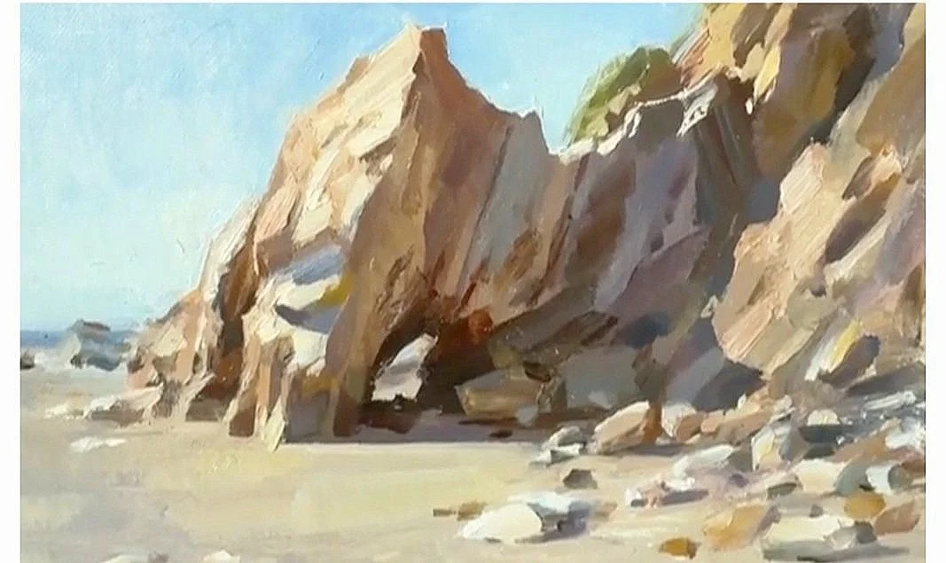
Mitch revisited two plein air paintings from Santa Barbara that illustrate this beautifully. Both were painted within a day or so of each other, but they each make different choices about where to place the emphasis.
In the first painting below, light dominates. He spent his time capturing subtle shifts and color variation in the sunlit areas, while reducing the shadows to simple, unbroken shapes.

In the second (below), he flipped the approach: shadow dominates. Mitch simplified the lit beach areas so that he could explore the striations and color notes within the rocky shadows.
It’s not that you can’t include information in both light and shadow—in fact, when studying, it’s often valuable to explore both. But for a painting to make a strong, coherent statement, one side needs to take the lead.
Looking to the Masters
To further understand this principle, we can look at how past masters used it in their own work.
William Wendt:
In many of Wendt’s paintings, he places his attention squarely in the light. The shadows remain quiet, massed, and supportive. He resists the temptation to break them up or over-detail them. Instead, he layers subtle color temperature shifts and value play in the lit areas—especially in grasses, foliage, and sky.
However, in other works, Wendt does the opposite. He places detail, variety, and richness in the shadows, and keeps the lights large and simple—sometimes rendered in only a single value or tone. This shift in emphasis changes the entire emotional and compositional reading of the piece.
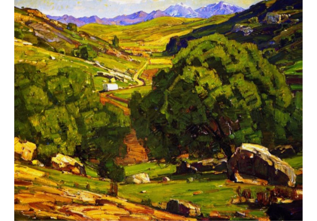
The Field Road by William Wendt
Edgar Payne:
Payne follows a similar path. When his light areas are the focus, he loads them with vibrant color variation and detail, while pulling together his shadows into unified, low-contrast masses. In other works, Payne pours all that visual complexity into the shadow, simplifying his light areas dramatically—sometimes into single, abstract shapes.
In both painters’ work, it’s clear that the dominance of light or shadow is a conscious choice, driven by the mood, light condition, and concept of the painting.
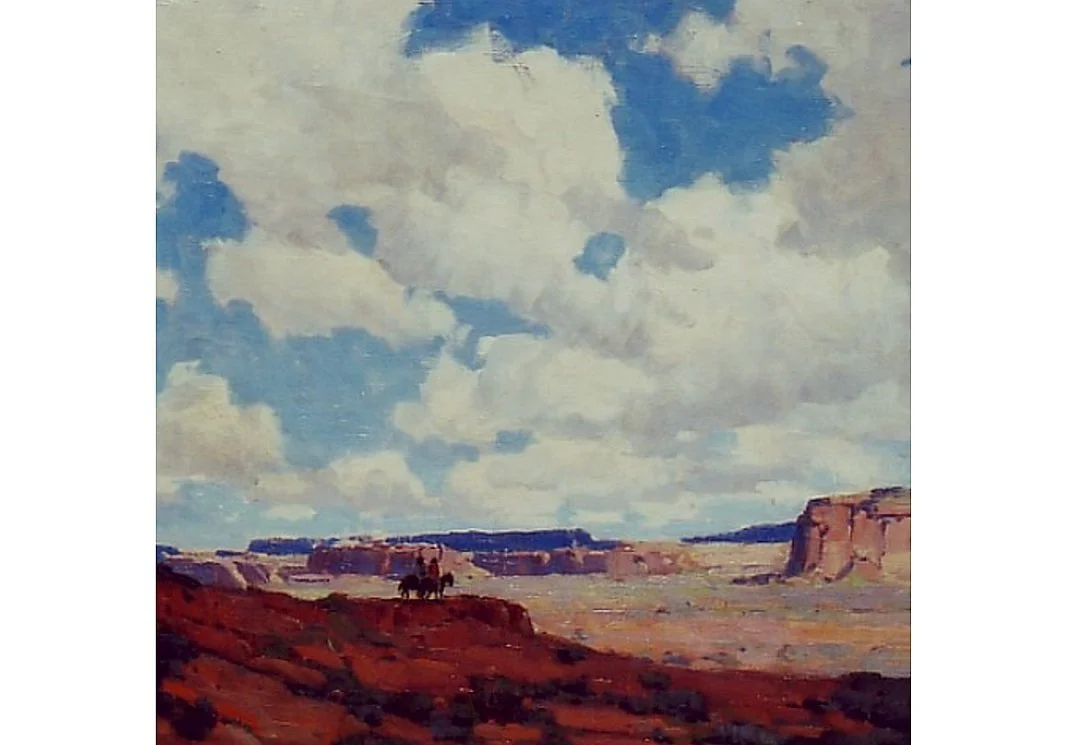
Canyon de Chelly by Edgar Payne
When and Why to Use This
Of course, not every painting needs to follow this model. Sometimes, nature throws you something more balanced. You might find, for instance, that the foreground light is simple, while the sky’s light is more complex. Or you may intentionally explore both zones in a study for educational purposes. But when your goal is clarity and visual strength, choosing a dominant side—light or shadow—will help your painting read more powerfully from across the room.
This approach is also a gateway. Each principle we study in painting—whether it's edges, shape design, value grouping, or atmospheric perspective—contains layers to uncover. And the idea of dominance between light and shadow is one such rabbit hole that offers a lot of depth and reward for those willing to explore it.
Final Thoughts
As you return to your easel, consider making this a conscious part of your design process. Ask yourself: Where do I want the information to live? and What side am I willing to let go of, to let the other shine? You might find that this one decision clears up many of the compositional struggles you’ve faced.
Join Mitch Baird through his mentoring course and free webinar below: