
Surface Quality
from Matt Smith
When we talk about great painting, we often focus on the subject—what’s depicted. But just as vital is how it’s depicted. The way you lay paint on a canvas—what John Carlson termed surface quality—can elevate a painting from competent to captivating.
Surface quality is about more than just brushstrokes. It’s the energy, rhythm, and thoughtfulness behind each mark you make. It's the visible character of your medium—how you let oil, watercolor, or gouache express themselves on the canvas.
Many artists fall into the trap of applying paint uniformly—dragging it off the brush in the same way, over and over. The result? A surface that’s redundant, flat, and ultimately unengaging. Your subject might be interesting, but if your surface doesn’t invite the viewer in, you’re missing half the opportunity.

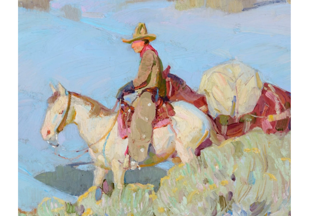
by Matt Smith
Using the Medium to Your Advantage
Each medium has its personality:
Watercolor is fluid and expressive, but demands forethought.
Gouache is fun and flexible.
Oil is rich with possibilities—thin washes, thick impasto, dry brushing, palette knife work. That variety makes it a powerful storytelling tool.
Take Carl Rungius as an example. His work showcases everything from delicate dry brush to thick, bold strokes. His brushwork follows the form of his animals, enhancing their dimensionality. He uses paint texture strategically—reserving roughness and buildup for focal areas, and letting passive areas remain smooth. This contrast builds visual drama.

By Carl Rungius
Painting as Conversation, Not Explanation
William Herbert Dunton’s approach also highlights painterly power. He suggests, rather than spells out, his forms. A chamisa bush, for instance, is defined just enough for the viewer’s mind to fill in the gaps. This invites the audience into the painting process and allows them to participate. Charles Movalli once wrote, “A highly rendered painting is as alive in a dark closet as it is on a wall because it doesn’t require the viewer to complete it.” Suggestion is confidence. Suggestion is trust in your viewer.
by William Herbert Dunton
Paint with Purpose, Not Habit
Thick paint should be intentional, not decorative. Especially in oil painting, where light catches raised ridges, it’s crucial to think about where and why you’re laying it down.
Keep shadow passages thin so the values don’t get lifted by light reflecting off texture. Reserve the thick, juicy impasto for the highlights—where light defines form. Think of the glow that emerges when light bounces off raised strokes in a sunlit area. That’s texture reinforcing realism.
Technique, no matter how dazzling, should never overpower the subject. Wayne Wolfe once quoted: “Technique should not overpower that which it represents.” When you rely too heavily on flashy brushwork or gratuitous texture, you risk losing clarity and meaning.
Balance painterly expression with faithful representation. Let the medium speak, but don’t let it scream over your subject.
Practice and Play
At first, exploring surface quality may feel chaotic. That’s okay. Mastery comes through experimentation. As you build control over your materials and confidence in your decisions, you’ll find new dimensions to your paintings—layers of interest that go far beyond outlines and accuracy.
So next time you pick up your brush (or knife or finger), ask yourself:
Am I using this texture purposefully?
Is my surface as engaging as my subject?
Have I left room for the viewer to join the experience?
When surface quality becomes part of your artistic language, your paintings will begin to breathe with a life of their own.
Join Matt Smith in his mentoring course and video series. Learn directly from his process, gain insight into mastering your medium, and elevate your own painting with expert guidance and personalized feedback: