
Seeing Color Complements
from Eric Jacobsen
Complementary colors are everywhere in nature, and learning to see and use them can transform the way you paint. In this post, we’ll explore how master painters have used complementary color relationships to bring harmony, energy, and balance into their work—and how you can do the same.
Start by Noticing the Color Theme
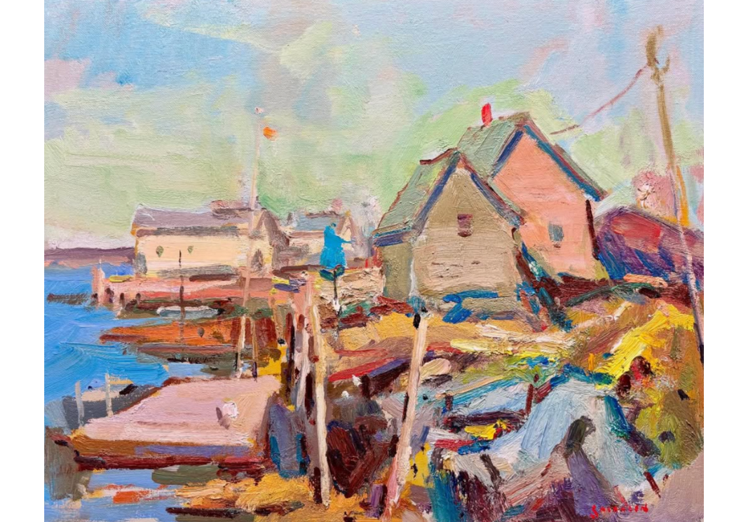
When you stand in front of a landscape, cityscape, or seascape, take a moment to pause and notice the overall color impression. Often, a dominant color will present itself—yellow-green leaves in early spring, the warm orange of autumn trees, or the cool blues of distant mountains.
Painters like Fedor Zakharov excel at observing these themes. In his work, a dominant yellow-green might be balanced with carefully placed purples, accented with subtle reds and brighter greens. The key takeaway: once you identify a dominant color, look for ways to introduce its complement to create balance

Choosing to See—or Create—the Complements
Sometimes complementary colors are naturally present. Other times, they may not be obvious. In those cases, you can intentionally push your painting in that direction.
For example, if you’re painting a white building in a green landscape, you might choose to shift the building toward a pink-red hue to balance the greens. This isn’t about copying the scene exactly—it’s about interpreting it in a way that heightens color harmony.
Still Life vs. Landscape: Different Controls, Same Goal
With still life painting, you can arrange objects and colors however you like. In the still life below by Sunny Apinchapong Yang (a student of Sergei Bongart), bright yellow flowers are paired with a purple-patterned cloth—an intentional setup of complementary colors.

In landscapes, you don’t have that physical control. Instead, you must edit with your brush, shifting or enhancing colors as needed to achieve the harmony you envision. In both cases, the guiding principle is the same: look for complementary relationships and use them to create balance.
Practical Ways to Train Your Eye
Simplify the Scene
When observing nature, try distilling the view into a basic complementary pair:
Is it a green-red scene?
A blue-orange scene?
A yellow-purple scene?
This simplification helps you avoid color overload and keeps your palette harmonious.
Use a Limited Palette
Working with one yellow, one red, one blue, and white forces you to mix your secondaries—orange, purple, and green—directly from primaries. This naturally creates harmony since all the colors relate to one another.
Push When Necessary
Don’t hesitate to nudge colors toward their complement. A slightly more orange tree, a purpler shadow, or a bluer sky can strengthen the overall vibration of the painting.
The Takeaway
Complementary color relationships are a powerful tool. By noticing the color theme in nature and intentionally introducing or amplifying complements, you can achieve harmony, energy, and impact in your work.
When you head out to paint, don’t just copy what you see. Instead, pause, simplify, and ask yourself: What’s the dominant color here? What’s its complement? From there, let your artistic choices guide the painting toward a rich, balanced whole.
Learn more from Eric through his mentorship or video series below: