
Enhancing Color Harmony
from Eric Jacobsen
Color harmony is one of the most important principles in painting, yet many artists overlook it. While painters often focus on composition, value patterns, and warm versus cool colors, understanding complementary colors can dramatically improve a painting.
What Are Complementary Colors?
Complementary colors are colors that sit opposite each other on the color wheel. Common complementary color pairs include:
Blue and orange
Red and green
Yellow and violet
When used together, complementary colors create visual balance and help colors appear more vibrant and alive.
Why Color Harmony Matters
A successful painting often has a dominant color. For example, a landscape painting may feature a large blue sky. If blue is the dominant color, introducing touches of orange can help create color harmony and balance.
The same principle applies to other color relationships. Green landscapes often benefit from hints of red, while yellow passages can become more interesting when balanced with subtle violets.
Our eyes naturally seek balance. When complementary colors are thoughtfully used throughout a painting, the result feels more unified and visually appealing.
Learning to See Complementary Colors Outdoors
One of the most exciting parts of painting from life is discovering complementary colors in nature. Once you begin looking for them, you'll start seeing these color relationships everywhere.
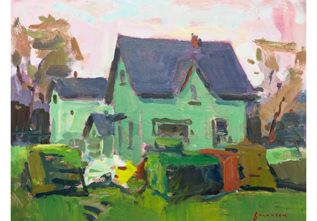
In the painting above, Eric used blue as the dominant color and balanced it with warm orange tones. The deep blue sky immediately captures attention, while the orange trees create a pleasing contrast that strengthens the overall design.
Interestingly, the trees were actually more yellow in real life. However, Eric intentionally shifted them toward orange because orange is a stronger complement to blue than bright yellow. This artistic adjustment created greater color harmony and made the painting more effective.
Artists Don't Have to Copy Nature Exactly
One of the key lessons Eric teaches is that painters should not feel obligated to copy colors exactly as they appear in nature.
If shifting a color slightly improves the overall harmony of the painting, it is often worth making the adjustment. A small change in color temperature, intensity, or hue can have a significant impact on the final result.
Rather than simply recording what you see, focus on creating a painting that feels balanced and harmonious. Sometimes that means adjusting a yellow tree toward orange, cooling a shadow, or introducing a complementary color that wasn't obvious in the original scene.
The goal is not perfect imitation. The goal is creating a stronger painting through thoughtful color relationships and intentional color harmony.
Study the world of color, composition, and technique as Eric shares his wealth of knowledge and experience through his video series or mentoring course: